


If you're in the slightest interested in video games, you're no doubt aware of Cyberpunk 2077. It's one of the most anticipated games of 2020. The world it paints has a certain style to it. The game's website does a brilliant job of portraying that aesthetic. Its design does a great job of communicating the look and feel. As you can imagine that means for some rather slick looking UI components.
Someone first reached out to me asking how I would create an image effect used on the site. If you hover images in the image galleries, they have this neat "noise" effect.
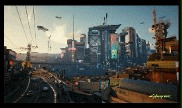
I accepted the challenge. I dug in to take a look at the site's source. After some digging, I discovered it was being implemented with shaders and WebGL. I'm completely new to writing shaders and WebGL. This did spur me to give it a try. But, for now, I've put learning WebGL and shader code on the backburner.
What did catch our eyes as I proceeded to look around the site on my live stream, was the neat glitchy effect buttons. I'm no stranger to creating glitchy effects with CSS. We decided I'd attempt to recreate them.

And here's how you can do it!
Let’s start with some Markup
<button class="cybr-btn">
  Beginning_
</button>
The thing we need to get sorted first is sizing, color, and font. The best way to get this right? Dive into the source and see how it's done. From the first inspection, we see that a custom font is being used.
Let's grab the font "Blender Pro Bold" font and create a custom @font-face rule.
@font-face {
  font-family: Cyber;
  src: url("https://assets.codepen.io/605876/Blender-Pro-Bold.otf");
  font-display: swap;
}
Once we have that, we can put the basic styling in place. Using CSS variables for things like color and font size gives us opportunities later. This is also the reason for using the HSL color space. We'll show why later.
--primary: hsl(var(--primary-hue), 85%, calc(var(--primary-lightness, 50) * 1%));
--shadow-primary: hsl(var(--shadow-primary-hue), 90%, 50%);
--primary-hue: 0;
--primary-lightness: 50;
--color: hsl(0, 0%, 100%);
--font-size: 26px;
--shadow-primary-hue: 180;
Putting that together gives us this starting point. Notice how we use an inset box-shadow instead of a border for that blue line? That's because a border would knock our text off-center. The inset box-shadow won't affect text-alignment.
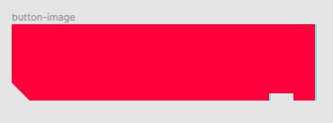
A noticeable feature of the button is that clipped corner. My first thought here is to use a clip-path. But, to my surprise, the shape of the buttons on the site is being achieved with a background-image.
We can clip the corner using a clip-path.
clip-path: polygon(-10% -10%, 110% -10%, 110% 110%, 10% 110%, -10% 40%);
Note how we're not clipping to the edges of the button. We're giving the button 10% of breathing room. That's because we need to account for the "R25" tag and the fact that the glitchy effect flows outside of the button. That's a neat trick with clip-path. We can use it as a controlled overflow: hidden. We're saying, "Yeah, you can overflow a little. But only this much".
Adding that to our button gives us the clipped effect we desire.
Next, let's create that "R25" tag. We could reach for a pseudo-element here and use the content property. In fact, this is how it's done on the site. There's something to be mindful of with this approach though. The fact that a screen reader might read it out. The same goes for the actual button text. Each button on the site has text succeeded by an underscore. Would we want that read out by a screen reader? If yes, then we can leave it as is. Let's assume they are for decorative purposes. We can update our markup and use aria-hidden so that a screen reader only reads the button's text.
<button class="cybr-btn">
  Clipped<span aria-hidden="true">_</span>
  <span aria-hidden="true" class="cybr-btn__tag">R25</span>
</button>
To style the tag, we can give it absolute positioning. This requires us to set relative positioning on the button. Like the button itself, the tag uses an inset box-shadow.
.cybr-btn {
  --label-size: 9px;
  --shadow-secondary-hue: 60;
  --shadow-secondary: hsl(var(--shadow-secondary-hue), 90%, 60%);
  position: relative;
}
.cybr-btn__tag {
  position: absolute;
  padding: 1px 4px;
  letter-spacing: 1px;
  line-height: 1;
  bottom: -5%;
  right: 5%;
  background: var(--shadow-secondary);
  color: hsl(0, 0%, 0%);
  font-size: var(--label-size);
  box-shadow: 2px 0 inset var(--shadow-primary);
}
We’ve introduced some more CSS variables here. Although they are being used by the tag, we've put them under the button selector. There's a reason for this. We may decide to leverage the power of scoped variables later. If we do, we only need to set the variables on the button selector. If we left the variables under the tag rule, variables set on the button wouldn't have power over the lower scope. We set a background-color for the tag. But, it soon becomes apparent that this isn’t being done on the site.
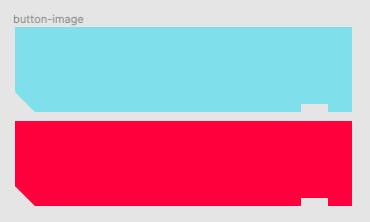
With our tag in place, the button is now taking shape.
It's time for the glitch effect. From experience, my assumption here was that the button was being duplicated. The duplicated button would have some form of clipping animation applied. Our first task here would be to create the glitch body. Remember we discovered the use of a background-image earlier? It soon became clear why that was being used. It’s used to provides a cutout for the tag. That means the background-color behind the button is the same for the tag. The corner cut out is also created with the image.
Notice how the blue border follows the corner and goes around the "R25"? Using a clip-path as we have cuts that corner off and doesn’t outline the “R25”. The site's implementation uses a drop-shadow.
Using a background image will allow us to recreate the effect. It comes with some compromises though if we want to make our buttons flexible and reusable.
For example, what if we want to change the color of the button? Do we have to create many images for each button color variant? What if we change the aspect ratio of the button? The image won't fit anymore.
The glitchy animation is quick. It's quick enough that it's unlikely the clipped corner would be noticeable. That trade-off is worth it for a more flexible and reusable set of styles.
Let's proceed with that solution. We can add a new element for the glitch. This needs the same text as our button and also needs hiding from the screen reader with aria-hidden.
<button class="cybr-btn">
  Glitch<span aria-hidden>_</span>
  <span aria-hidden class="cybr-btn__glitch">Glitch_</span>
  <span aria-hidden class="cybr-btn__tag">R25</span>
</button>
We need to duplicate the text here and we have options. The site uses a pseudo-element for duplicating the text. If we do this though, it means animating two elements at once for the effect. By moving the text into the glitch element, we only need to animate one element.
.cybr-btn__glitch {
  position: absolute;
  height: 100%;
  width: 100%;
  top: 0;
  left: 0;
  box-shadow: 0 0 0 4px var(--shadow-primary);
  text-shadow: 2px 2px var(--shadow-primary), -2px -2px var(--shadow-secondary);
}
Applying some styles such as text-shadow and a box-shadow get us here.
But, we’re not satisfied with that corner clipping. Also, how we’re using the clip-path to give breathing room feels brittle. We could get it back with a little trick. If we use pseudo-elements to color the button, we won't have to clip the entire button! We could use absolute positioning and then clip only the pseudo-elements. We also won’t need to provide breathing room. The bonus here as well is that we already have the button colors in variables.
.cybr-btn {
  --clip: polygon(0 0, 100% 0, 100% 100%, 8% 100%, 0 70%);
}
.cybr-btn:before {
  content: '';
  position: absolute;
  top: 0;
  left: 0;
  right: 0;
  bottom: 0;
  background: var(--primary);
  clip-path: var(--clip);
  z-index: -1;
}
We can remove the clip-path from the button and put that clip into a variable that we can reuse. We need to apply z-index: -1 to the pseudo-elements so that the text still shows.
.cybr-btn {
  --border: 4px;
}

.cybr-btn__glitch {
  position: absolute;
  top: calc(var(--border) * -1);
  left: calc(var(--border) * -1);
  right: calc(var(--border) * -1);
  bottom: calc(var(--border) * -1);
  background: var(--shadow-primary);
  text-shadow: 2px 2px var(--shadow-primary), -2px -2px var(--shadow-secondary);
  clip-path: var(--clip);
}

.cybr-btn__glitch:before {
  content: '';
  position: absolute;
  top: calc(var(--border) * 1);
  right: calc(var(--border) * 1);
  bottom: calc(var(--border) * 1);
  left: calc(var(--border) * 1);
  clip-path: var(--clip);
  background: var(--primary);
  z-index: -1;
}
We can then reuse the clip for the glitch element’s pseudo element. The trick to getting the glitch element correct is to position it absolutely as if it is the border. Then overlay the pseudo element on top of it. Applying the same clip to both elements will give us the neat blue border that follows the corner.
That gives us:
How nifty is that? We can even adjust the clip-path to get that cut out around the "R25". If we adjust the clip-path and remove the tag styles:
.cybr-btn {
  --clip: polygon(0 0, 100% 0, 100% 100%, 95% 100%, 95% 90%, 85% 90%, 85% 100%, 8% 100%, 0 70%);
}

.cybr-btn__tag {
  position: absolute;
  padding: 1px 4px;
  letter-spacing: 1px;
  line-height: 1;
  bottom: -5%;
  right: 5%;
  color: hsl(0, 0%, 0%);
  font-size: var(--label-size);
}
We get something like this:
And this is where we have the opportunity to do something else cool. When I investigated the button and discovered the background-image, I pulled it down. And what I found was that the border was possible by stacking two images and translating the bottom one. Now, we are using a clip-path, we can do the same.
If we use the :before pseudo-element for our button's blue color and the :after for the red. Then we translate the :before pseudo-element by the border size, it will give us the border. It gives us the border without applying a border.
.cybr-btn:after,
.cybr-btn:before {
  content: '';
  position: absolute;
  top: 0;
  left: 0;
  right: 0;
  bottom: 0;
  clip-path: var(--clip);
  z-index: -1;
}

.cybr-btn:before {
  background: var(--shadow-primary);
  transform: translate(var(--border), 0);
}

.cybr-btn:after {
  background: var(--primary);
}
Now we have the shadow for the tag and the button. And the tag will use the background-color behind it. Try changing the background-color for the body and you’ll see!
Almost there! Hang in. We have the glitch. We've got everything we need. All that's left is to animate it on :hover.
How is that glitch effect happening? The trick is to only show the glitch element on :hover and by default have an animation applied to it. My assumption here was the use of transform and clip-path in a set of keyframes. And I was right! How did I find out. Inspect the button and use Chrome's "force state" to set the button to the :hover state.
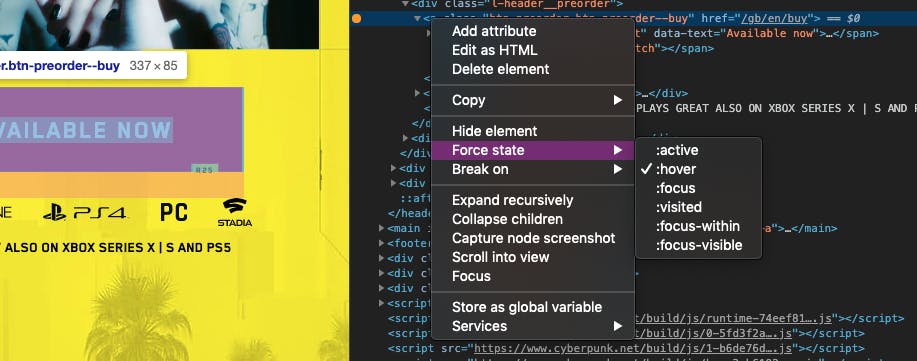
Then, inspect the styles and find the animation. Click the filename and that will take you to the source.
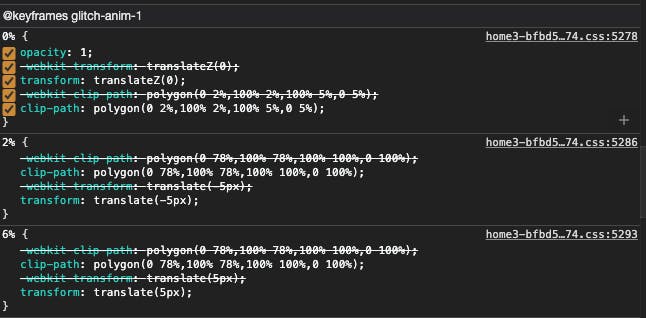
That allowed me to see the keyframes that were being used.
@keyframes glitch-anim-1 {
    0% {
        opacity: 1;
        -webkit-transform: translateZ(0);
        transform: translateZ(0);
        -webkit-clip-path: polygon(0 2%,100% 2%,100% 5%,0 5%);
        clip-path: polygon(0 2%,100% 2%,100% 5%,0 5%)
    }

    2% {
        -webkit-clip-path: polygon(0 78%,100% 78%,100% 100%,0 100%);
        clip-path: polygon(0 78%,100% 78%,100% 100%,0 100%);
        -webkit-transform: translate(-5px);
        transform: translate(-5px)
    }

    6% {
        -webkit-clip-path: polygon(0 78%,100% 78%,100% 100%,0 100%);
        clip-path: polygon(0 78%,100% 78%,100% 100%,0 100%);
        -webkit-transform: translate(5px);
        transform: translate(5px)
    }

    8% {
        -webkit-clip-path: polygon(0 78%,100% 78%,100% 100%,0 100%);
        clip-path: polygon(0 78%,100% 78%,100% 100%,0 100%);
        -webkit-transform: translate(-5px);
        transform: translate(-5px)
    }

    9% {
        -webkit-clip-path: polygon(0 78%,100% 78%,100% 100%,0 100%);
        clip-path: polygon(0 78%,100% 78%,100% 100%,0 100%);
        -webkit-transform: translate(0);
        transform: translate(0)
    }

    10% {
        -webkit-clip-path: polygon(0 54%,100% 54%,100% 44%,0 44%);
        clip-path: polygon(0 54%,100% 54%,100% 44%,0 44%);
        -webkit-transform: translate3d(5px,0,0);
        transform: translate3d(5px,0,0)
    }

    13% {
        -webkit-clip-path: polygon(0 54%,100% 54%,100% 44%,0 44%);
        clip-path: polygon(0 54%,100% 54%,100% 44%,0 44%);
        -webkit-transform: translateZ(0);
        transform: translateZ(0)
    }

    13.1% {
        -webkit-clip-path: polygon(0 0,0 0,0 0,0 0);
        clip-path: polygon(0 0,0 0,0 0,0 0);
        -webkit-transform: translate3d(5px,0,0);
        transform: translate3d(5px,0,0)
    }

    15% {
        -webkit-clip-path: polygon(0 60%,100% 60%,100% 40%,0 40%);
        clip-path: polygon(0 60%,100% 60%,100% 40%,0 40%);
        -webkit-transform: translate3d(5px,0,0);
        transform: translate3d(5px,0,0)
    }

    20% {
        -webkit-clip-path: polygon(0 60%,100% 60%,100% 40%,0 40%);
        clip-path: polygon(0 60%,100% 60%,100% 40%,0 40%);
        -webkit-transform: translate3d(-5px,0,0);
        transform: translate3d(-5px,0,0)
    }

    20.1% {
        -webkit-clip-path: polygon(0 0,0 0,0 0,0 0);
        clip-path: polygon(0 0,0 0,0 0,0 0);
        -webkit-transform: translate3d(5px,0,0);
        transform: translate3d(5px,0,0)
    }

    25% {
        -webkit-clip-path: polygon(0 85%,100% 85%,100% 40%,0 40%);
        clip-path: polygon(0 85%,100% 85%,100% 40%,0 40%);
        -webkit-transform: translate3d(5px,0,0);
        transform: translate3d(5px,0,0)
    }

    30% {
        -webkit-clip-path: polygon(0 85%,100% 85%,100% 40%,0 40%);
        clip-path: polygon(0 85%,100% 85%,100% 40%,0 40%);
        -webkit-transform: translate3d(-5px,0,0);
        transform: translate3d(-5px,0,0)
    }

    30.1% {
        -webkit-clip-path: polygon(0 0,0 0,0 0,0 0);
        clip-path: polygon(0 0,0 0,0 0,0 0)
    }

    35% {
        -webkit-clip-path: polygon(0 63%,100% 63%,100% 80%,0 80%);
        clip-path: polygon(0 63%,100% 63%,100% 80%,0 80%);
        -webkit-transform: translate(-5px);
        transform: translate(-5px)
    }

    40% {
        -webkit-clip-path: polygon(0 63%,100% 63%,100% 80%,0 80%);
        clip-path: polygon(0 63%,100% 63%,100% 80%,0 80%);
        -webkit-transform: translate(5px);
        transform: translate(5px)
    }

    45% {
        -webkit-clip-path: polygon(0 63%,100% 63%,100% 80%,0 80%);
        clip-path: polygon(0 63%,100% 63%,100% 80%,0 80%);
        -webkit-transform: translate(-5px);
        transform: translate(-5px)
    }

    50% {
        -webkit-clip-path: polygon(0 63%,100% 63%,100% 80%,0 80%);
        clip-path: polygon(0 63%,100% 63%,100% 80%,0 80%);
        -webkit-transform: translate(0);
        transform: translate(0)
    }

    55% {
        -webkit-clip-path: polygon(0 10%,100% 10%,100% 0,0 0);
        clip-path: polygon(0 10%,100% 10%,100% 0,0 0);
        -webkit-transform: translate3d(5px,0,0);
        transform: translate3d(5px,0,0)
    }

    60% {
        -webkit-clip-path: polygon(0 10%,100% 10%,100% 0,0 0);
        clip-path: polygon(0 10%,100% 10%,100% 0,0 0);
        -webkit-transform: translateZ(0);
        transform: translateZ(0);
        opacity: 1
    }

    60.1% {
        -webkit-clip-path: polygon(0 0,0 0,0 0,0 0);
        clip-path: polygon(0 0,0 0,0 0,0 0);
        opacity: 1
    }

    to {
        -webkit-clip-path: polygon(0 0,0 0,0 0,0 0);
        clip-path: polygon(0 0,0 0,0 0,0 0);
        opacity: 1
    }
}
For our animation, we can follow the same structure. But in our example, we can apply different versions of our clip-path.
.cybr-btn {
  --shimmy-distance: 5;
  --clip-one: polygon(0 2%, 100% 2%, 100% 95%, 95% 95%, 95% 90%, 85% 90%, 85% 95%, 8% 95%, 0 70%);
  --clip-two: polygon(0 78%, 100% 78%, 100% 100%, 95% 100%, 95% 90%, 85% 90%, 85% 100%, 8% 100%, 0 78%);
  --clip-three: polygon(0 44%, 100% 44%, 100% 54%, 95% 54%, 95% 54%, 85% 54%, 85% 54%, 8% 54%, 0 54%);
  --clip-four: polygon(0 0, 100% 0, 100% 0, 95% 0, 95% 0, 85% 0, 85% 0, 8% 0, 0 0);
  --clip-five: polygon(0 0, 100% 0, 100% 0, 95% 0, 95% 0, 85% 0, 85% 0, 8% 0, 0 0);
  --clip-six: polygon(0 40%, 100% 40%, 100% 85%, 95% 85%, 95% 85%, 85% 85%, 85% 85%, 8% 85%, 0 70%);
  --clip-seven: polygon(0 63%, 100% 63%, 100% 80%, 95% 80%, 95% 80%, 85% 80%, 85% 80%, 8% 80%, 0 70%);
}

@keyframes glitch {
  0% {
    clip-path: var(--clip-one);
  }
  2%, 8% {
    clip-path: var(--clip-two);
    transform: translate(calc(var(--shimmy-distance) * -1%), 0);
  }
  6% {
    clip-path: var(--clip-two);
    transform: translate(calc(var(--shimmy-distance) * 1%), 0);
  }
  9% {
    clip-path: var(--clip-two);
    transform: translate(0, 0);
  }
  10% {
    clip-path: var(--clip-three);
    transform: translate(calc(var(--shimmy-distance) * 1%), 0);
  }
  13% {
    clip-path: var(--clip-three);
    transform: translate(0, 0);
  }
  14%, 21% {
    clip-path: var(--clip-four);
    transform: translate(calc(var(--shimmy-distance) * 1%), 0);
  }
  25% {
    clip-path: var(--clip-five);
    transform: translate(calc(var(--shimmy-distance) * 1%), 0);
  }
  30% {
    clip-path: var(--clip-five);
    transform: translate(calc(var(--shimmy-distance) * -1%), 0);
  }
  35%, 45% {
    clip-path: var(--clip-six);
    transform: translate(calc(var(--shimmy-distance) * -1%));
  }
  40% {
    clip-path: var(--clip-six);
    transform: translate(calc(var(--shimmy-distance) * 1%));
  }
  50% {
    clip-path: var(--clip-six);
    transform: translate(0, 0);
  }
  55% {
    clip-path: var(--clip-seven);
    transform: translate(calc(var(--shimmy-distance) * 1%), 0);
  }
  60% {
    clip-path: var(--clip-seven);
    transform: translate(0, 0);
  }
  31%, 61%, 100% {
    clip-path: var(--clip-four);
  }
}
This is the trickiest part to comprehend. What is actually happening here? Our keyframes animate a clip path on the glitch element. At the same time, we shimmy the element from side to side. We can slow down the animation to see what's happening.
And I've also put together a demo that shows the different states of the clip.
This would make it much easier for us to maintain and tweak the different animation states.
All that's left to do is tie this up to the :hover selector. By default, we hide the glitch element. Then on hover, we show it animating.
.cybr-btn__glitch {
  display: none;
}
.cybr-btn:hover .cybr-btn__glitch {
  display: block;
}
And that gives us the result we were looking for.
That’s it!
That’s how you recreate the Cyberpunk 2077 buttons with only CSS!
Remember, how we used variables for the colors, there was a reason for that. Combining HSL with the variables, we can not only add color variants easily. But, we can also add an :active color change too.