


With the Chrome 88 release, we got support for clip-path: path(). That means it now has support in "most" major browsers!
With path(), we’re able to use path definitions for a clip-path (Catch up on what clip-path is here). These path definition strings are the same as those we can use with the SVG path element. What's cool about this is that it provides a way to create shapes that before may have meant using SVG. We can even create paths that break without requiring any tricks.
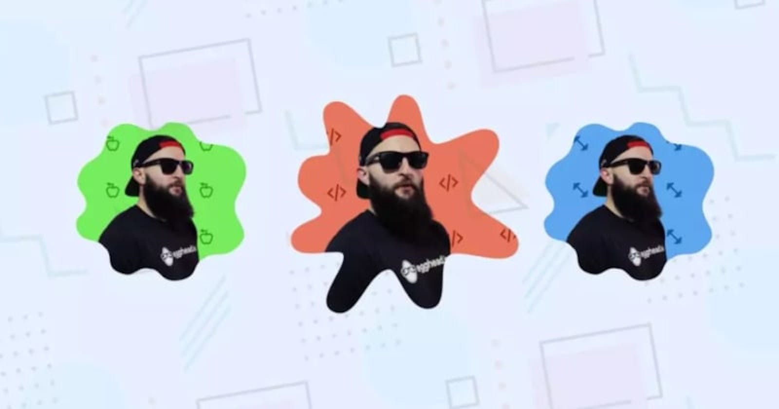
With the increased support came an opportunity to try something fun with it! Let’s make “Squeaky Portraits”! A fun take on using clip-path: path() to clip the viewable area of an element into these “Nickelodeon-esque” splats.
Creating a Path
First up, we need our own SVG style path definition string. And in this case, more than one. The neat thing with clip-path is that we can transition them with CSS. As long as the clip-path function and number of nodes are consistent, we can transition.
To make some paths, we can hop in any vector graphic editor. In this case, I’m using Figma. And instead of creating the paths from scratch, we can use a desired "splat" as a foundation. This one looks good!
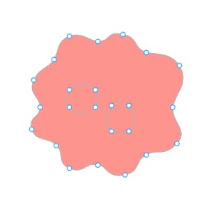
The trick here is to create more splats based on the foundation splat. And we need to do this without introducing or removing any nodes. These are the three splats I came up with. But, you could make any shapes you like as long as you stick to that rule!
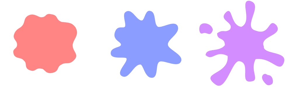
You may notice that the third splat has two blobs that separate off from the main shape. This is fine. Because SVG path definitions allow us to do this. We can start a line, close it, and move to another point to start another.
But didn't I say they needed a consistent number of points? They do. And they do! Those two blobs appear for each splat. But, the trick is that we can move them behind the rest of the path when they aren't needed.
Once we have our splats, we can export them and grab the path definition strings.
Applying Splats
To apply the splats, we're going to create variables for each path.
.portrait {
  --splat: "M161 188.375C170 193.5 177.919 193.854 186 188.375C197.919 180.294...";
  --splattier: "M161 188.375C170 193.5 177.919 193.854 186 188.375C197.919...";
  --splatted: "M232.5 256C225 251 209.5 262.5 224 281.5C232.736 292.948...";
}
These are the paths we’ve lifted straight out of the exported SVG.
We’re going with the names “splat”, “splattier”, and “splatted”. Naming things is hard. Ha! But, if we take for example the “splatted” SVG.
<svg width="300" height="300" viewBox="0 0 300 300" fill="none" xmlns="http://www.w3.org/2000/svg">
  <path d="M232.5 256C225 251 209.5 262.5 224 281.5C232.736 292.948 238.561 297.756 251 290.5C257 287 256.114 271.924 250 264.5C243.886 257.076 240 261 232.5 256ZM147 92.5C118.738 94.6708 118 17 93 44C68 71 123.543 76.5 108 101.5C90.5 115 70.81 98.3664 64 115C56.7766 132.643 91.1967 136.948 90.5 156C89.4406 184.974 19.1766 161.499 24.5 190C29.9178 219.006 78.6461 172.635 100 193C130.207 221.808 1 248.5 58.5 291.5C94.5576 318.465 114.991 206.551 140.5 211C183.5 218.5 134.5 294 186.5 279.5C207.5 273 174.638 224.658 196 204C223.117 177.777 275.916 253 291.5 218.5C311.375 174.5 228.698 194.565 224 160C219.553 127.282 291.5 123.5 267.5 87.5C238.5 57 247 125.5 196 105.5C147 92.5 229.5 13.5 173.5 2.5C140.5 2.49999 183.532 89.694 147 92.5ZM45 92.5C36.8766 80.3149 14.1234 75.3149 6.00001 87.5C0.584412 95.6234 2.00001 120.357 14.5 115C27.9606 109.231 36.8766 124.685 45 112.5C50.4156 104.377 50.4156 100.623 45 92.5Z" fill="#A91CFF"/>
</svg>
We’re lifting out the d attribute from the path elements and creating CSS variables for them. Next, we need an element to apply these to. Let's create an element with the class "portrait".
<div class="portrait"></div>
Next, apply some styling to it:
.portrait {
  --splat: "M161 188.375C170 193.5 177.919 193.854 186 188.375C197.919 180.294...";
  --splattier: "M161 188.375C170 193.5 177.919 193.854 186 188.375C197.919...";
  --splatted: "M232.5 256C225 251 209.5 262.5 224 281.5C232.736 292.948...";
  --none: "";
  height: 300px;
  width: 300px;
  background: #daa3f5;
  clip-path: path(var(--clip, var(--none)));
  transition: clip-path 0.2s;
}
Here’s a demo where you can switch between the different clip states:
Note how the shape transitions between the three splat shapes. But, also note how we've given our element an explicit height and width. This size matches the dimensions of our SVG exports. This is important. This is the one drawback of using clip-path: path(). It's not responsive. The path definition is relative to the dimensions of your element. This is the same problem faced by CSS motion paths.
This is fine if we're mindful of the sizes of things we're clipping. We could also create different path variables for different viewport sizes. But, if you have images that resize in a fluid way, other solutions using SVG are going to be more robust.
Interaction
For our demo, we want the splat to be interactive. We can do this with CSS alone. We can use a scoped CSS variable --clip to control the current clip. And then we can update that variable on both :hover and :active. The --active state is triggered when we press our pointer down.
.portrait {
  clip-path: path(var(--clip, var(--splat)));
}
.portrait:hover {
  --clip: var(--splattier);
}
.portrait:active {
  --clip: var(--splatted);
}
Throw that together and we get something like this. Try hovering over the splat and pressing it.
Adding Some Character
Now we can transition the splat, it needs a little something extra. What if we transform it in those states too?
.portrait {
  transition: clip-path 0.2s, transform 0.2s;
  transform: scale(var(--scale, 1)) rotate(var(--rotate, 0deg));
}
.portrait:hover {
  --scale: 1.15;
  --rotate: 30deg;
}
.portrait:active {
  --scale: 0.85;
  --rotate: -10deg;
}
Using scoped CSS variables to apply a transform, we can add something. Here we update the scale and rotation of our splat. We can experiment with different values and play with different effects here. Translating the element a little could look good?
Adding a Portrait.
Now for the fun stuff! I wouldn't recommend using these pictures of me. But, you can if you want ha! I had this idea that I'd take three silly pictures of myself and have them respond to the user. I got some help and ended up with these three pictures.

Then we need to put them into the portrait.
<div class="portrait">
  <img class="portrait__img" src="/me--standing.png" alt="Me"/>
  <img class="portrait__img" src="/me--noticing.png" alt="Me"/>
  <img class="portrait__img" src="/me--falling.png" alt="Me"/>
</div>
That won’t look great. They need some styles.
.portrait {
  position: relative;
}
.portrait__img {
  height: 100%;
  width: 100%;
  position: absolute;
  top: 0;
  left: 0;
}
Almost.
How can we show and hide them on :hover and :active. It's a little verbose but we can use nth-of-type with display: none.
.portrait__img {
  display: none;
}
.portrait__img:nth-of-type(1) {
  display: block;
}
.portrait:hover .portrait__img:nth-of-type(1),
.portrait:hover .portrait__img:nth-of-type(3) {
  display: none;
}
.portrait:hover .portrait__img:nth-of-type(2) {
  display: block;
}
.portrait:active .portrait__img:nth-of-type(1),
.portrait:active .portrait__img:nth-of-type(2) {
  display: none;
}
.portrait:active .portrait__img:nth-of-type(3) {
  display: block;
}
Why not refactor those styles and group them up? The cascade will kick in and we won't get the effect we want.
Parallax Icons
We're getting there but it looks a little bland. We could create a rudimentary parallax effect if we pull in an icon. Let's go with this one.

The trick here is to use an image as a background for our element but size it so that it tiles with background-repeat.
.portrait {
  background-image: url("/code-icon.svg");
  background-color: hsl(10, 80%, 70%);
}
Neat.
But, we want parallax! To get that parallax effect, we can update the background-position in response to pointer movement. And we can map the pointer position against some limit that we define.
Let's start by creating a utility that generates a mapping function for us. The returned function will give us the result of a value in one range mapped onto another.
const genMapper = (inputLower, inputUpper, outputLower, outputUpper) => {
  const inputRange = inputUpper - inputLower
  const outputRange = outputUpper - outputLower
  const MAP = input => outputLower + (((input - inputLower) / inputRange) * outputRange || 0)
  return MAP
}
Take a moment to understand what’s happening here. For example, if our input range was 0 to 500 and our output range was 0 to 100. What would the result of calling the returned function be with 250? It would be 50.
// Generate a function
genMapper(0, 500, 0, 100)
// Returns a function by going through these steps
const inputRange = 500
const outputRange = 100
const MAP => input => 0 + (((input - 0) / 500) * 100)
// If our input value is 250
(250 / 500) * 100
0.5 * 100
// The result!
50
Once we have our utility function to generate the mapping functions, we need a limit to use with it. And we need to generate a mapper for both the horizontal and vertical axes.
const LIMIT = 25 // The amount our icons can move in pixels in either direction
const getX = genMapper(0, window.innerWidth, -LIMIT, LIMIT)
const getY = genMapper(0, window.innerHeight, -LIMIT, LIMIT)
The final part is tying that up to an event listener. We destructure the x and y value from the event and set CSS variables on the portrait element. The value comes from passing x and y into the respective mapping functions.
const PORTRAIT = document.querySelector('.portrait')
document.addEventListener('pointermove', ({ x, y }) => {
  PORTRAIT.style.setProperty('--x', getX(x))
  PORTRAIT.style.setProperty('--y', getY(y))
})
And now we have parallax icons!
The Squeak
Last touch. It's in the title. We need some squeaks. I usually find audio bytes on sites like freesound.org. You can get them in all places though and even record them yourself if you want.
It’s not a bad idea to create an object where you can reference your Audio.
const AUDIO = {
  IN: new Audio('/squeak-in.mp3'),
  OUT: new Audio('/squeak-out.mp3'),
}
Then, to play an audio clip, all we need do is
AUDIO.IN.play()
We need to integrate this with our portrait. We can use the pointerdown and pointerup events here – the idea being that we play one squeak when we press and another on release.
If a user clicks the portrait a lot in quick succession this could cause undesirable effects. The trick is to play the desired sound and at the same time, stop the other. To "stop" a piece of Audio, we can pause it and set the currentTime to 0.
PORTRAIT.addEventListener('pointerdown', () => {
  AUDIO.OUT.pause()
  AUDIO.IN.currentTime = AUDIO.OUT.currentTime = 0
  AUDIO.IN.play()
})
PORTRAIT.addEventListener('pointerup', () => {
  AUDIO.IN.pause()
  AUDIO.IN.currentTime = AUDIO.OUT.currentTime = 0
  AUDIO.OUT.play()
})
And that gives us a “Squeaky Portrait”!
That’s It!
That's how you make "Squeaky Portraits". But, the actionable thing here is having fun while trying out new things.
I could have morphed a couple of shapes and left it there. But, why stop there? Why not come up with an idea and have some fun with it? It's a great way to try things out and explore techniques.
We:
- Created the clips
- Morphed them with transitions
- Made interactive images
- Added Audio
- Created parallax with a mapping utility
What could you do with clip-path: path()? What would your "Squeaky Portrait" look like? It could do something completely different. I'd love to see what you make!
As always, thanks for reading. Wanna see more? Come find me on Twitter or check out the the live stream!
p.s If you want to grab all the code. It’s here in this CodePen collection.
Stay Awesome! ʕ •ᴥ•ʔ